
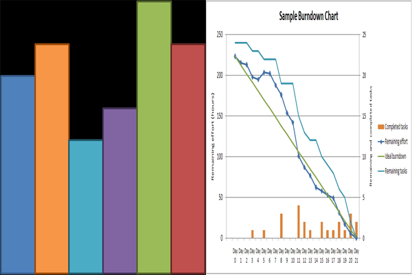
Written reports, thesis, financial statements and the like are more accurate, informative, reliable and relevant when some illustrations are used for statistical and decision making purposes. Graphs and charts play a vital role when it comes to the presentation per se of these documentations because you can easily understand the information by simply looking at its pictorial data.
The graphs represent a coordinate plane in a form of a cross that illustrates the horizontal line or the x-axis and the vertical line or the y-axis. This kind of feature shows the relationship of the selected variables and the variations took place over time. Graphs make use of the degree angles to measure the relativity of the variables. Graphs are commonly used in mathematical figures and elasticity of economic relationship in terms of prices, supply and demand.
In terms of charting, this may range from different shapes, sizes and colors; it represents the relationship of the variables at a given point of time only. Charts are popular in portraying economic data to visibly demonstrate the significant information in a form of percentages, amounts, or numbers at a specified time such as determining the rate of population as to those who are employed, unemployed and migrated or viability of household expenses.

